Modern retail design is moving away from fixtures that compete with the merchandise. The strongest metal display racks create order, guide attention, and make change easier without appearing visually heavy. Their value comes from proportion, restraint, material honesty, and a detailed understanding of how customers move through a store.
A modern look is not one universal style. It may be minimal and architectural, warm and mixed-material, technically expressive, or strongly branded. What connects successful designs is that every visible decision has a retail purpose. The ideas below can be adapted to permanent store fixtures, category displays, promotional units, and branded point-of-sale programs.
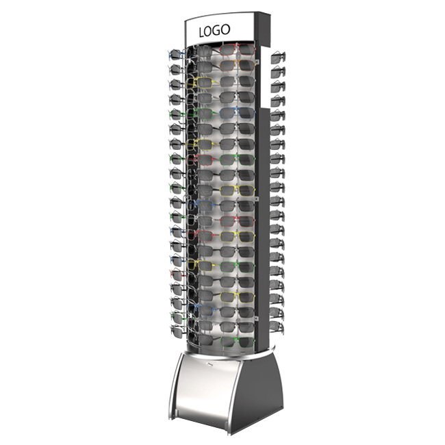
Begin With a Visual Hierarchy
Decide what shoppers should notice first, second, and third. The hero product or category message deserves the clearest sightline; supporting ranges need orderly facings; prices and specifications should appear where the decision occurs. Frame lines, shelf edges, lighting, and graphic panels can all reinforce this sequence.
A rack becomes confusing when headers, side graphics, product packaging, and promotional labels demand equal attention. Reduce competing elements before adding decoration.
• Keep one dominant message visible from the aisle.
• Reserve detailed specifications for the customer’s decision zone.
• Allow product packaging to provide color before adding more graphics.
Use Slim Frames Without Ignoring Strength
Narrow metal sections create a lighter appearance and leave more visual space for products. However, slimness must be engineered. Tube profile, bends, weld locations, shelf spans, base geometry, and hidden reinforcement determine whether the fixture remains stable under load.
Hide strength where it adds no visual value
Bracing can be placed behind graphics, beneath shelves, or within folded sections. The objective is not to make the rack fragile-looking, but to keep structural work from interrupting the merchandising composition.
Combine Metal With Warm Materials
Powder-coated steel paired with timber, melamine, acrylic, or textured graphic panels can prevent a store from feeling industrial. A dark frame with pale shelves creates contrast; a neutral metal structure with warm wood introduces a residential tone suitable for home goods, beauty, apparel, or specialty retail.
Mixed materials must be designed for different expansion, fastening, cleaning, and shipping behavior. Samples should confirm that joints remain neat and that one surface does not scratch another during assembly.
Treat Color as a Navigation Tool
Color can identify a department, product family, price tier, or promotional story. Modern displays often use a restrained base color and reserve stronger accents for headers, shelf edges, or key interaction points. This makes future graphic changes easier while keeping the main structure usable.
Specify finish, not only color
Gloss level, texture, lighting, and neighboring materials change how a color appears. Physical powder-coated samples are more reliable than screen references when brand consistency matters.
Create Adjustable Displays That Still Look Intentional
Adjustment slots, pegboard holes, slatwall channels, and movable shelves support changing ranges, but excessive visible perforation can look utilitarian. Modern design integrates the adjustment system into a repeated pattern or places it where products conceal it.
Set a limited family of shelf and hook positions based on real packages. Useful flexibility is better than theoretical flexibility that stores never use.
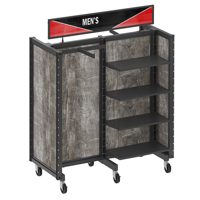
Build Modular Displays for Changing Store Formats
A modular family can use common uprights, bases, shelves, and graphic frames to create several widths or heights. This helps brands adapt to flagship stores, small-format locations, shop-in-shops, and regional assortments while maintaining recognition.
Design the connection as carefully as the module
Modules should align cleanly, assemble predictably, and remain stable alone or in a run. Shared components require clear identification so stores do not mix incompatible revisions.
Use Product-Led Shapes
A distinctive silhouette can reference the product without becoming theatrical. Angled shelves may echo speed for automotive accessories; soft radiused corners can suit personal care; vertical tool zones can express precision. The shape should improve access, viewing, or brand recall rather than consume floor space.
View the concept both empty and fully stocked. A dramatic outline that disappears behind products adds cost without contributing to the final presentation.
Integrate Graphics Instead of Attaching Them Later
Headers, side panels, shelf strips, and logo plates work best when their dimensions and fixing methods are defined with the frame. Integrated graphic zones protect alignment and make replacement easier. They also prevent bolts, hooks, or products from covering critical artwork.
Prepare for campaign changes
Permanent frames can carry replaceable seasonal graphics. Tool-free clips, magnetic panels, or slide-in channels allow updates while avoiding tape residue and inconsistent store execution.
Add Lighting Only Where It Improves the Decision
Lighting can emphasize texture, color, or premium products, but it introduces wiring, heat, certification, maintenance, and installation questions. Concealed LED strips under shelves can improve visibility when ambient light is weak; illuminated logos can strengthen distance recognition.
Before adding light, test whether better shelf spacing, contrast, or graphic hierarchy solves the problem more simply. Technology should support merchandise, not become the merchandise.
Design for Touch, Reach, and Replenishment
Modern appearance should survive daily use. Rounded corners, comfortable reach zones, smooth product removal, accessible price labels, and clear refill paths affect how customers and employees perceive quality. Handles, locks, and caster brakes should be intuitive without dominating the design.
Observe the rack in motion
Ask someone unfamiliar with the project to shop, refill, clean, move, and assemble the prototype. Small moments of friction reveal more than a static presentation rendering.
A useful design review records the reason for every visible feature. The team should be able to explain how a shelf angle improves the product view, why an accent color directs attention, and how a removable panel supports future campaigns. Details without a clear job are candidates for removal, reducing both visual noise and manufacturing cost.
The same review should compare the display from the aisle, at arm’s reach, and while partially depleted. Modern fixtures must remain coherent after customers disturb the planogram; otherwise, the concept works only in photography and not in a working store.
Let Sustainability Come From Useful Decisions
A durable frame, replaceable graphics, repairable components, efficient material use, and compact shipping can extend value beyond a single campaign. Designing a rack for reuse is often more meaningful than adding an environmental message to a disposable structure.
Avoid unsupported claims. Document materials, finishes, replacement parts, packing volume, and intended service life so sustainability statements are specific and verifiable.
Three Modern Directions Worth Testing
Rather than copying a trend, develop a controlled concept and test it with real merchandise:
• Quiet architecture: neutral powder coating, slim verticals, concealed fixings, and generous negative space.
• Warm utility: a durable metal skeleton combined with timber-toned shelves and simple information panels.
• Modular brand system: shared metal components, replaceable color accents, and graphics tailored to each store format.
Manufacturing capabilities across metal, wood, acrylic, shelving, rotating units, and store fixtures make these mixed approaches practical subjects for prototyping. The final choice should still follow the brand, category, budget, and retail environment.
Conclusion
Modern metal display rack design is less about adding fashionable details and more about editing the fixture until its purpose is clear. Slim structure, controlled color, integrated graphics, modular components, useful adjustability, and thoughtful material contrast can create a contemporary result. The design succeeds when it looks composed, carries its real load, supports store work, and keeps products—not hardware—at the center.
Frequently Asked Questions
These answers address common decisions during modern retail fixture development.
What colors make a metal display rack look modern?
Neutral black, white, charcoal, and warm gray are versatile, but brand accents can be equally modern when used with restraint. Finish texture and surrounding materials are as important as hue.
Can a modern rack still hold heavy products?
Yes. Reinforcement can be integrated beneath shelves, behind panels, or inside formed sections. Loaded engineering must determine the profile and connections.
Are mixed-material displays difficult to ship?
They require careful separation and protection, but knock-down connections and component-specific packaging can make international shipping practical.
How can stores update a display without replacing it?
Use replaceable graphics, adjustable shelves, modular accessories, and a durable neutral frame. Keep revision records so future parts remain compatible.
Post time: Aug-20-2026